Color Theory
#1 Primary, Secondary
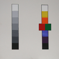
#2-Value or Brightness
#3-Hues
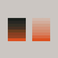
#4-Comparing Value Scales
#5-Working Out
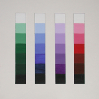
Value Scales in Color
Value Scales in Color
Exercise#6
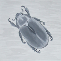
Grayscale:Scarab
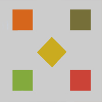
#7-One Color Looking Different
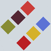
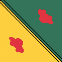
#8-Two Colors
Looking Similar
Looking Similar
#9-Saturation
#10-Warm, Cool Sensations Generated by Hues
#11-Designs
with
Hue Gradations
Hue Gradations