Inventory of Web Sites
Bad Interface Design
(1) Sahalee
Country Club
Sahalee
Country Club
(2)Cranston
Village
(3)Waverly
|
Inventory of Web Sites
|
||||||
|
Bad Interface Design
|
||||||
|
(1)
|
||||||
|
(2)
|
||||||
|
(3)
|
||||||
| Bad Interface Design/Sahalee Country Club (1) |
 |
Company:
URL: |
 |
||||
| This is the newly renovated web site for Sahalee Country Club, a golf community located in Sammamish, Washington, near Seattle. It is a private golf club of approximately 500 members. Surrounding the 27-hole golf course lies Sahalee Estates, a residential 500-home community. Sahalee Estates is not directly tied in with the operation of Sahalee Country Club, but is able to enjoy the physical properties offered by rolling green fairways and tall, mature Douglas firs. | ||||||
| Sahalee Country Club was built in 1968 by a group of avid golfers who wanted only golf in a club association; i.e., no tennis courts, no swimming pool, etc....so the focus at Sahalee is definitely in golf, golf, golf. | ||||||
| Because Sahalee is a private club, the site was established so that most of the daily activities are located beyond a "password only" link. | ||||||
| In the private pages of the membership roster, one scrolls alphabetically through "a" as an example. After the first page of "a" if finished, one must return to the top of the page before being allowed to proceed to the "b" roster. I believe members would be better served if a "next" occurred at the bottom of the page so that a viewer would not have to return to the top of the page. The way it is set up now is an inconvenient nuisance. Aesthetically, however, the color scheme of maroon, grey, and white is handsomely carried through the entire site. | ||||||
| The quality of the graphics is superb. I believe the pictures of the golf course change about once a week. If the pictures themselves do not change, then the positioning within the site of those pictures seems to change. The picture shown at the "home page" has been tampered with...maybe they tried to optimize it and surrendered quality. It seems to be the only photo on which they have feathered the edges. | ||||||
| I would like to see a "home" button alongside the others on the left-hand side of the home page (as well as repeated on all of the other pages).. A "home" is listed at the bottom of most of the pages, but one has to be at the bottom of the page to even see the "home" option. | ||||||
| Navigation exists to outside golfing links: PGA, PNGA, LPGA, USGA, 2002 NEC Invitational, Sahalee Players Championship, etc. In practically all of these cases, one hyperlinks right out of the Sahalee site, but maybe that is the way the site designers wanted it. | ||||||
| In a prior site, the ability to email Sahalee did not exist. Those provisions now are contained in the new site version. | ||||||
| There is no search capability on the Sahalee site. After spending considerable time reviewing the site, I am now in a better position to comment to the webmaster at Sahalee and suggest improvements I feel should be made to the site. | ||||||
| Provision used to be made for the Sahalee newsletter to be included in the site, but if it is still being posted, it is buried so deeply within the site that I cannot locate it. Shame! Oops, I just found the newsletter! They have scanned the newsletter into the site and the print is so small that one simply cannot read it. | ||||||
| Since I have come up with so many dead-ends, I am now going to change my mind...I started out thinking Sahalee could qualify for a "good interface design" category, but am changing it to the "bad interface design" category. | ||||||
| Bad Interface Design/Cranston Village (2) | |||||
|
Company:
URL: |
 |
Cranston Village |
 |
||
 |
|
Although Cranston Fabrics are well known to quilters (under the V.I.P. label), the quaint web site offers much to be desired in the way of concrete information regarding availability and price of those fabric designs they manufacture and represent. |
||||
| In days past, it was absolutely futile to even go to their web site, because they claimed to represent, as an example, Mary Engelbreit fabrics. They did, in fact, have the license to manufacture and distribute the Engelbreit line, but on the web and even on the phone, a potential patron could not get satisfactory information regarding those products to which Cranston had exclusive manufacturing rights. | ||||
| On the flash page, they account for a recent accolade from a quilting book (I've read the book), but those who gave the award must have given it for the cutsey look of the site as opposed to function (meaning someone who genuinely wants to examine a fabric line and purchase the fabric). In examining this recently renovated site, I went from the flash page to the home page and still did not get precise directions on where to navigate to look for fabric. From the home page I tried the links on the left of home page....trying to go to "Places to Visit". The link did not work. I tried another link on the home page, "Welcome". It did not respond. (I guess I was not welcome!) I finally clicked on "Village Calendar", which I had no desire to see, but the link responded and took me to a calendar. When I got to the calendar page, it told me I could click on buildings within the bannerhead to navigate to stores for specific products. That meant I would be four levels into the site before I had even come close to what I wanted, and I was not yet certain I would find fabrics on that fourth level in. Doesn't this outfit manufacture fabric? | ||||
| When I clicked on "Quilt Corner", the only fabrics I could find was a section called "Cotton Fabrics of the 1960's", not fabric, but history of fabric! So, now, let's see....how are their minds going anyway? How would they actually label fabric? The Village Herald did have it. The Crafts Corner didn't have it. Of course, the library wouldn't have it. I went to the Cranston Mill and they wanted to tell how fabric was made in the Middle Ages. Well, finally, when I went to the Village Gallery (where I thought I would find art and pictures, I found fabric...that is, I found a list of different designers for whom Cranston manufactures fabric. | ||||
| I decided to select Mary Engelbreit. Be prepared to wait an eternity. I takes so long for the selection to load that I could have found the fabric, bought it, and even started a quilt by now! In rendering the fabric selections, they haven't divided them into specific collections where just that collection would render. Instead, one goes through waiting for volumes of Engelbreit fabrics to render. Not a way to run a railroad! (or a web site!) | ||||
| I have tried finding a variety of items on this site. The site truly contains volumes of information and great effort and time probably has gone into trying to make it attractive, but they have failed dramatically on the single most important feature to viewers, accessibility! You can be entertained here for hours, but not find what it is for which you are searching. | ||||
| Prices or even price ranges for items are never given on this site. When I've gone to a local retailing source as given by the Cranston site, they have not carried that item and have recommended I call Cranston and see where that specific item might have shipped so that I could pursue the item that way. AND I've already mentioned what happens when one calls Cranston! | ||||
| Their list gives fourteen domestic distributors...that's a far cry from the hundreds of fabric shops throughout the U.S. Can you detect a runaround? | ||||
| All of this hype, and Cranston Village does not sell any fabric in-house. They have well-publicized tours of their mill, but reinforce repeatedly on the site that the cute village as depicted on the site does not, in fact, exist. | ||||
| There is a scrollbar on a number of the menu pages, when there are not enought items to warrant the scrollbar?? | ||||
| In going through their source code trying to find the measurements of their tables, they have used 100% width on all of the tables I could locate. In the source code I found mention of a movie which was to keep repeating, "The Cranston Village is a Graphic Illustration created to assist you in navigating within our website. It is not an actual village town to visit."....but I couldn't find the movie! | ||||
| Speaking to the retailers about Cranston, they just throw up their hands! They obviously have problems also. So, this site is a con job...a cute con job... but a con job! | ||||
| Bad Interface Design/Waverly (3) | ||||
|
Company:
URL: |
Waverly |
 |
||
 |
||||
| I have had desperation at this site before. It has dead-ended me so many times. They hyperlink to so many other establishments and then there is simply no way back to their site. Their navigation is deplorable. | ||||
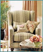
| I want to like this web site. The pictures and products are wonderful, marvelous, etc. If I had hours to spend looking at pleasing room vignettes, this would be where I should park. | ||||
| At the home page, when one clicks on any of the buttons in the table of contents, just be prepared to wait a long, long time. Waverly has this wait on practically every one of their pages because they have so many pictures and graphics and they presumably haven't figured out a way to optimize their graphics so they have a respectable download time to the viewer. The only pages where I seemed to get a lightning fast response was on the "your account" and "shopping bag" pages. | ||||
| They have a search capability on every page, but since it takes so long for everything to load and respond, I am hesitant to use the search box. Just imagine how long I might have to wait for it to search their site database. The search button is very low on the left-hand side of the page, very close to being below the fold. Very inconvenient location for the viewer. | ||||
| They have a "home" button on the left side of the page, but instead of being at the top of the list, they have the "home" button at the bottom of the list. Waverly has very long (too long) scrolling pages and when one wants to return to home, you have to scroll all of the way up to the top of the page. They have no "to top" (of page) buttons to aid in this navigation. | ||||
| A number of the navigation buttons on the left side of the page fall below the fold and you can't even see them without a considerable scroll. | ||||
| The only merchandise they appear to sell at this web site are wallpaper and fabric samples. I suspect the purpose of this site is to popularize the Waverly line for decorators and interior designers who most often work through design centers anyway. The Waverly line (F.Schumacher and Company) have various patterns and designs available at Calico Corners and other local fabric stores, but the high end of their line is available only through decorators. | ||||
|
©2000-2005 Examples of Good and
Bad Web Site Design.com. All rights reserved.
All images and content are © copyright of their respective copyright owners. |