Inventory of Web Sites
Bad Site Design
(1) Cookies
in Bloom
Cookies
in Bloom
Cookies
in BloomSisters
and Brothers of Hotlanta Book Club http://www.hgu.mrc.ac.uk/Bad/bad.htm
|
Inventory of Web Sites
|
|||
|
Bad Site Design
|
|||
|
(1) Cookies
in Bloom |
|||
| (2)Sisters
and Brothers of Hotlanta Book Club |
|||
| (3)http://www.hgu.mrc.ac.uk/Bad/bad.htm
|
|||
| Bad Site Design/Cookies in Bloom (1) | |||
|
Company:
URL: |
Cookies in Bloom |
 |
|
| I believe the design was intended to be organized around the needs of cookie and gift shoppers, but this site's designers are in the kitchen and not in ecommerce. I originally started out believing this was maybe a fairly respectable site but, after going through it meticulously, I began to see features which disturbed me and actually took the site from good to bad (in fact, very bad!). | |||
| Links from the pages back to the home page are not functioning correctly. There is no wording such as "Home Page" on any of the pages to direct a viewer back to the home page. In other words, there are no navigational directions on the site in the way of words and links. Store operating hours are not shown on the home page! The store hours are shown on the shipping and delivery page. | |||
| Consistent background color scheme throughout site. Grid is consistent on most pages. Not certain if I would have chosen this bright green (bgcolor="#83C037") for the pages' background (being used as a sample for purposes of this critique. When dealing with the food industry, colors are extremely important to convey a clean, correct, and safe message. Font colors are red, royal blue, and black. It appears the designer has allowed the standard default colors for links, visited, and active. | |||
| I personally prefer sequencing the buttons on the home page as Home, About Us, Products, Contacts. This sequence seems to be standard practice and the sequencing selected at the Cookies in Bloom site bothers me since it departs from what I had anticipated in navigational sequence. The button named "Products" should be more site specific; i.e., Cookie Arrangements as a button name would be more appropriate. | |||
| The menu selection for products is wonderfully "event-complete", along with a description page on each item upon clicking on the thumbnail. Of note, however, is that the web site author has not installed any "to top" buttons on many long, scrolled pages. | |||
| The site map appears logical, except there is no effective navigation to local retailers. What good does it do for people to shop the site if they cannot get local access? The local phone numbers are given, but no hyperlink to any local franchise appears. In checking further, I note that only two locations have web sites established; Bellevue, Washington, and West Palm Beach, Florida. Two of the links do not function or render correctly. I think the task of setting up a web site is left to the individual franchise operator and thus the absence of those active hyperlinks. The pages on the main site take a long time to load, but there are numerous pictures of the "event" cookie bouquets. Photographs of cookie bouquets are inconsistent in size and, in going over the sizes of the files, I noticed a number of the photographs had not been optimized--the files were far too large for rapidly linking and rendering. | |||
| There should definitely be a shipping page on the home page button array, because this is a perishable edible and prompt, timely delivery is essential. There should be delivery lead-time information, since many purchasers send these arrangements at a last-minute's notice (and expect the local franchise to be able to deliver a freshly-baked, personally-decorated arrangement on a same-day basis). Then the shipping page data should be repeated when the shopping cart checkout is ready to be totaled. Many customers pick up their arrangements at the store, enabling the owners to potentially create a shorter turnaround time from the time of order placement to the time of order completion and pickup. | |||
| I find the checkout form page very lacking and disorganized. The physical setup of the page could be easily and correctly tabulated to give the impression "Cookies in Bloom" is a sanitary, organized, and efficient establishment. These elements are paramount when offering a product which is edible and perishable. This page is extremely bland in appearance. Perhaps the logo could be repeated on this page to introduce some energy and color. | |||
| I am personally familiar with this organization. I find the national site quite misleading because I know the prices are generally not consistent nationally across the board. There is no evidence of delivery, tax, or shipping charges, and in the Puget Sound area, the shipping charges can be pricey. Even though the home page "links" to a page showing dealers in the United States, there are no active web sites when you reach the "addressess and phone numbers." I also noticed in these "address and phone number" boxes for the franchisees that no store/operating hours are given. The Puget Sound franchisee also sells daily-baked undecorated cookies, and I notice there is no mention of this product offering. Custom orders are frequent, and I find no mention of willingness and ability to accommodate these requests. Occasionally, a customer wishes the arrangement to be parceled in a customer-supplied container, and the store owners are willing to advise and cooperate in this procedure as well. | |||
| Bad Site Design/Sisters and Brothers of Hotlanta Book Club (2) | ||
|
Company:
URL: |
Sisters and Brothers of HotLanta Book Club |
|
 |
 |
|
|
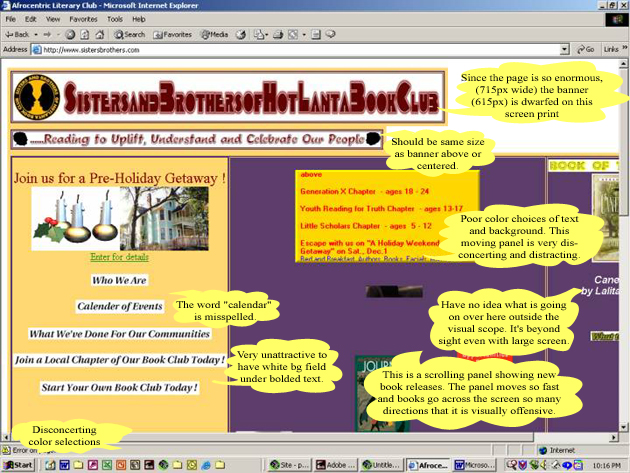
Upper Portion of Sister and Brothers of HotLanta
Book Club
|
||
 |
||
|
Lower Portion of Sister and Brothers of HotLanta
Book Club
|
||
 |
||
| It was extremely painful to go through this site. I wanted to leave right away, rather than try to take a look at everything that was going wrong. Look at those colors: purple: #5C3C69 and gold: #FFD770! | ||
| I knew immediately that because of the immensity of this screen (the first table was 715 pixels across), there would probably even be some items I didn't or couldn't see (bad design for screen settings). Every item or page just seemed to be added on to what was a beginning horrible home page. I think the author of this site is trying to learn coding of some type (and is failing in the attempt). | ||
| From the home page, when I clicked on "Enter for details", up came a page where ten images were not rendering! I stopped counting misspelled words and grammatical errors. | ||
| When you go to the page "Who We Are", this slide show fades into the page "Who We Are" with a smoky effect. Bad taste! | ||
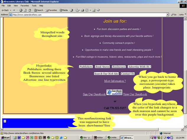
| There is an image slide show of bouncing books (may be PowerPoint) and a scrolling open frame section of calendar events going on. Talk about confusing! It's one of those examples where a web designer is trying to use a portion of every web tool and gimmick available. In going from internal page link to page link, one experiences what is that traditional PowerPoint circle effect before the next page is introduced. I believe the image slide show is tied into this linking. Very distracting! This feature may strongly inhibit the time it takes to link from one page to another....you have to go through this exotic screen transfer and it takes forever. | ||
| Several weeks ago when I first discovered this calamity, I dropped a note to the webmaster(?) suggesting the next time he or she went into the site, a certain spelling might be corrected. When I went into the site today, the email page has been altered--when someone sends a suggestion, there is the option to check a box to select that the message only go to the webmaster (obviously circumventing the ability for all to read any specific comments regarding site design/contents). | ||
| Signing up to join a local chapter of their book club is just something else...the form is so long and extensive that it appears you would be signing up to join the FBI! | ||
| Searching is conducted through Excite (Excite for web servers 1.0) | ||
| Examples of some of the pages listed on the home page are below. When trying to link into any of these pages, it takes forever....(don't suffer through the links shown on the upper left home page)... | ||
|
Publishers:
|
There is nothing there except one URL. When trying to hyperlink back to the home page, there is no link given back to the home page and a lot of people do not know to press the "back" button to get there. When trying to hyperlink to the URL given, the link is dead. Font color cannot be seen because of poor color contrast selection. |
|
Book Stores:
|
There are several entries (5) here. When trying to hyperlink "back to home page", there is no working link (http://www.sistersbrothers.com/frame1.html). Dead link. Hyperlink font color cannot be seen because of poor color selection. |
|
Businesses:
|
There is one entry here. When trying to return/link "back to home page", there is no link except to the server (http://www.sistersbrothers.com/frame1.html). Dead link. Hyperlink font color cannot be seen because of poor color selection. |
|
Advertise:
|
There is no hyperlink possibility back to the home page. |
|
Search:
|
Through Excite (Excite for web servers 1.0) taking you to http://www.sistersbrothers.com/AT-sisterallsearchquery.html |
|
Contact:
|
No hyperlink possibility back to the home page. |
| NOTE: | To retain peace of mind, DO NOT GO to this site! |
|
|||
| Bad Site Design/http://www.hgu.mrc.ac.uk/Bad/bad.htm (3) | |||
|
Company:
URL: |
This is just a horrible (unnamed/uk) site nobody claims. |
No logo for this mess
|
|
| What a horrible site (sight as well!)! I followed a search for "bad web page design" and got this. Ugh! | |||
| Animation going everywhere.Horribly dark colors.Cannot read text. There is no contrast between the text and the background color. | |||
| How about this color for a background? (#FF00CC) | |||
| The screen said, "Thanks for visiting from http://www.google.com/search?q=bad+web+page+design&hl=en&start=10&sa=N!" | |||
| Gif file that took a long time to load. | |||
|
|
|||
| "Comments on this page to somebody" | |||
| "Last updated sometime ago" | |||
| This pulldown which likened a clock...".Like computers
don't have clocks already!!!! (But actually it's a very neat bit of JavaScript
from Cut-N-Paste JavaScript from ISN Toolbox Copyright 1996, Infohiway,
Inc. .) - it may not work with the UNIX version of Netscape though. Time
Hour Min Sec...horrible! Date Saturday, October 27, 192001" (isn't this a less-than-desirable way of stating the date?) |
|||
| The scrolling message read: "Some trite nonsense about how wonderful this page is--don't you wish all pages were like this?" (DON'T GO HERE!) | |||
|
Top | Home | Good
Interface | Bad Interface |
Good Site | Good
Page | Bad Page | Best
Site | Worst Site
|
|
©2000-2005 Examples of Good and
Bad Web Site Design.com. All rights reserved.
All images and content are © copyright of their respective copyright owners. |