| |
|
Inventory of Web Sites
|
|
Good Interface Design
|
|
|
(1) Writer's
Digest Writer's
Digest
|
(2)iVillage
|
(3)Sauder
Manufacturing Company
|
| |
| Good Interface Design/Writer's Digest (1) |
|
|
Company:
URL:
|
|  |
|
| Writer's Digest is a periodical focused on aiding and abetting
literary authorship and commerce of the written word. For more than 75 years,
the Writer's Digest family of books and magazines has informed, instructed
and inspired writers. The web site for Writer's Digest is a natural continuation
of that endeavor and places great emphasis on encouraging aspiring authors
of all genre. |
|
| Although it is currently written in frames, the grid established
presents a uniform, easy-to-read format. The layout is multi-colored, both
in fonts and backgrounds, although as one migrates through the site map,
these background colors and font treatments are fairly consistent. |
|
| There are ample graphics to entice the reader's eye suggesting
that authors to "dare to publish" or "dare to try to publish."
I don't believe I read the words "publish or perish" anywhere
on the site. |
|
| Hyperlinks and great navigation take one to tons of information
on subjects such as publishers and their specialty fields, who in America
is writing and publishing successfully, tips on writing styles, writing
seminars scheduled, a "brag board" to note accomplishments, etc. |
|
| Various chat room opportunities exist for checking in with
individuals of like writing passsion and interest Multiple links carry the
viewer into a variety of sites suggested for ordering specific books and
writing aids. |
|
| A lengthy resource for checking out the contents of Writer's
Digest latest issues, with a service provided to search and order back issues
and even subscribe—all online. |
|
| I encountered very few dead links or dead-end pages. The site
is so huge and there are so many hyperlinks outside of the Writer's Digest
immediate site, that several small literary groups have at one time established
small web sites, but have not kept their sites current or tastefully rendered.
This is merely a problem of daring to "leave the Writer's Digest site"...you
leave the organized and efficient focus so consistent in the Writer's Digest
environment. Fine navigation appears to be paramount for Writer's Digest
viewers. |
| |
| |
| Good Interface Design/iVillage.com (2) |
|
|
Company:
URL:
|
|
|
| |
| I happened upon iVillage.com during literary pursuits. It
has a strong hyperlink tie to amazon.com, so that is probably why I observed
the name iVillage.com fairly frequently. Although I saw a multi-linked home
page layout, not until I reviewed it carefully did I realize it was a woman's
version of networking and communications. Basically, the site consists of
the home page, from which a minimum of at least fifty links are directed.
It reminds me of a woman's AOL...once you are in the site, there is so much
information available via linking, that one just doesn't leave soon. |
|
| iVillage.com is a women's network of communications...radio,
TV, web site, periodicals, etc. |
|
| Their meta tag on the site reads: "iVillage.com offers
busy women a community in which to share advice. Join other women like you
to talk about, books, parenting, careers, computers, diet/fitness, food,
money, pets, relationships, beauty, shopping, travel and working from home." |
|
| The grid used on the home page is four-columned, with a fifth
column introduced on the far right-hand side if you have browser and monitor
resolution to accept that large of a display. Most table widths are between
620-640 pixels. |
|
| The color coding is consistent throughout the site. Fonts
used are generally verdana and arial. I noticed a great deal of 8 pt. fonts.
The site is written in java script with cascading style sheets. |
|
| The home page has at least six drop-down search areas, in
addition to the iVillage.com search capability which is housed in the upper-righthand
corner of the home page. |
|
| Directorywise, the main subject headings are: babies, beauty,
diet and fitness, entertainment, food, health, home and garden, horoscopes,
money, parenting, pregnancy, pets, relationships, shopping, and work. |
|
| I encountered no dead-end hyperlinks to the second level of
hierarchy. |
|
| The site gives me a sense of safety and comfort with its design,
colors, and available data. |
| |
| |
| Good Interface Design/Sauder Manufacturing
Company (3) |
| |
| |
| |
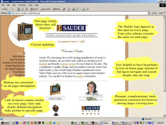
| Soundings regarding Sauder.... |
| |
| If someone happened upon this site not at all intending to
purchase furniture, the image the site projects has such a positive impact
that one will most certainly remember the site and wish to do business with
the company this site represents. |
| 1. Site colors are subdued and placid, subliminally representing
the soft wood tones utilized in the furniture being manufactured; i.e.,
white, tan, and a darker brown. The site navy blue used most generally depicts
a business, rather than casual, environment. Pages representing the various
furniture categories are color coded in conservative hues; blue for office/computer,
lavender for entertainment, green for bedroom, tan for shelving/storage,
turquoise for kitchen/utility, and tan for the collections. |
| 2. Very little of the home page resides below the fold. All
essential navigational tools reside in prime real estate on the left side
of each page. |
| 3. Since these products are not sold directly from the site
itself, of utmost importance is to so deeply impress the viewer that he/she
will pursue the products locally. A dynamic web site can bridge that gap
between manufacturer and consumer, hoping that the retailers who represent
the manufacturer will provide a reinforcing, rather than a distracting,
consummation of the sale. Because of the confidence the site represents
to me, I would prefer being able to deal with Sauder directly, but their
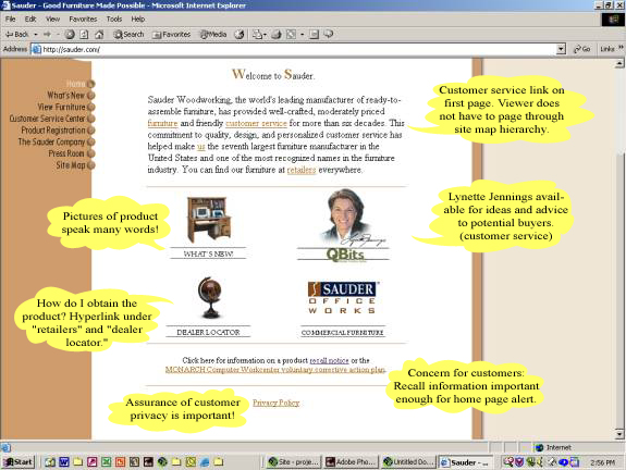
person-to-person customer service helps to fill that void. |
| 4. Navigation is a a surfer's dream. No broken links were
detected and the site map hierarchy is reasonable, sensible, and well articulated.
The wealth of knowledge when one reaches either the third or fourth level
of the hierarchy is rewarding enough for the pursuit. Specific product information
is wonderfully comprehensive...all measurements, wood finishes, prices,
etc. contained within a single specification sheet. |
| 5. No noticeable distracting pop-up windows, blinking images,
or offensive java scripting. |
| 6. Product searches can be conducted through a Furniture Finder
page, concise, but complete and effective. |
| 7. New products are shown on a New Products page, as well
as within their respective collection grouping. |
| 8. Photographs of room vignettes are tastefully feathered,
introducing the softness shown on few sites. Conversely, product photographs
show clean, clear, precise lines and details. Rendering is rapid, so I suspect
all photographs have been adequately optimized for web usage. |
| 9. The company is clearly keeping current on site technology.
Rollovers, thumbnails, and magnified product shots all contribute toward
ease and visual enjoyment on the site. |
| 10. Customer service is actually a live humanoid! When I've
had questions on a couple of occasions, I've been able to phone (their site
lists their phone number!...most sites don't want to deal directly with
the public, so they intentionally omit the phone number). On the last occasion
when I phoned inquiring about the availability of a specific item, the Sauder
employee answered my inquiry with courtesy and knowledge. It was extremely
late at night, but someone was there to "receive" my call. Sauder
is located in Ohio and I was calling from Washington state, so I was keenly
aware of the difference in the time-zone element. |
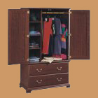
| 11. We are customers. The packaging is appropriate. The techniques
and instructions are simplified, but most adequate. Our den is populated
by bookcases, lateral files, coffee table, end tables, telephone stand,
computing storage unit, night stands, and two armoires...all in the Heritage
Hill Collection, cherry finish, by Sauder. Our room offers the comforts
of Sauder's warm wood tones and our high tec equipment. It is in this room
that we spend the majority of our productive working hours. Many visitors
comment on the warm comfort of this room...and they end up at the Sauder
web site! |
|