Inventory of Web Sites
WORST

SITE
|
Inventory of Web Sites
|
||
|
WORST
|
|
SITE
|
|
Company:
URL: |
Sisters and Brothers of HotLanta Book Club |
|
 |
 |
|
|
Upper Portion of Sister and Brothers of HotLanta
Book Club
|
||
 |
||
|
Lower Portion of Sister and Brothers of HotLanta
Book Club
|
||
 |
||
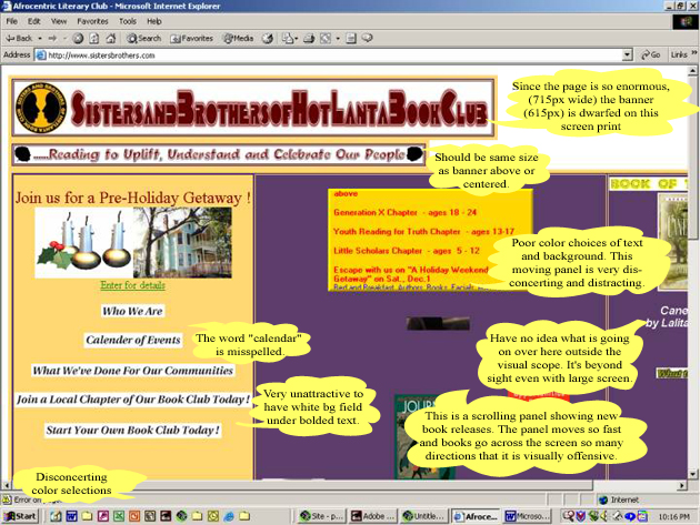
| It was extremely painful to go through this site. I wanted to leave right away, rather than try to take a look at everything that was going wrong. Look at those colors: purple: #5C3C69 and gold: #FFD770! | |
| I knew immediately that because of the immensity of this screen (the first table was 715 pixels across), there would probably even be some items I didn't or couldn't see (bad design for screen settings). Every item or page just seemed to be added on to what was a beginning horrible home page. I think the author of this site is trying to learn coding of some type (and is failing in the attempt). | |
| From the home page, when I clicked on "Enter for details", up came a page where ten images were not rendering! I stopped counting misspelled words and grammatical errors. | |
| When you go to the page "Who We Are", this slide show fades into the page "Who We Are" with a smoky effect. Bad taste! | |
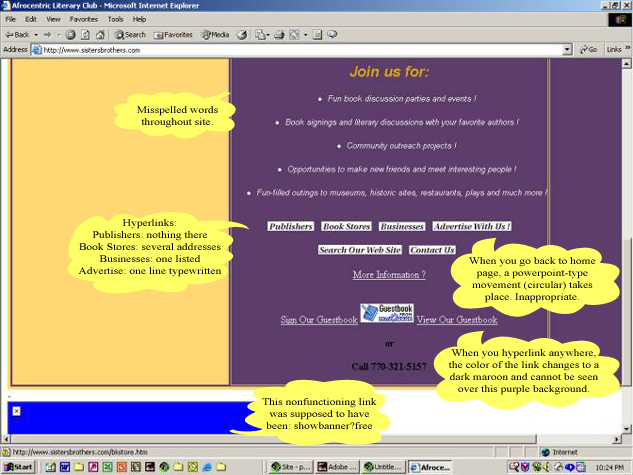
| There is an image slide show of bouncing books (may be PowerPoint) and a scrolling open frame section of calendar events going on. Talk about confusing! It's one of those examples where a web designer is trying to use a portion of every web tool and gimmick available. In going from internal page link to page link, one experiences what is that traditional PowerPoint circle effect before the next page is introduced. I believe the image slide show is tied into this linking. Very distracting! This feature may strongly inhibit the time it takes to link from one page to another....you have to go through this exotic screen transfer and it takes forever. | |
| Several weeks ago when I first discovered this calamity, I dropped a note to the webmaster(?) suggesting the next time he/she went into the site, a certain spelling might be corrected. When I went into the site today, the email page had been altered--when someone sends a suggestion, there is the option to check a box to select that the message only go to the webmaster (obviously circumventing the ability for all to read any specific comments regarding site design/contents).. | |
| Signing up to join a local chapter of their book club is just something else...the form is so long and extensive that it appears you would be signing up to join the FBI! | |
| Searching is conducted through Excite (Excite for web servers 1.0) | |
| Examples of some of the pages listed on the home page are below. When trying to link into any of these pages, it takes forever....(don't suffer through the links shown on the left upper home page)... | |
|
Publishers:
|
There is nothing there except one (1) URL. When trying to hyperlink back to the home page, there is no link given back to the home page and a lot of people do not know to press the "back" button to get there. When trying to hyperlink to the URL given, the link is dead. Font color cannot be seen because of poor color contrast selection. |
|
Book Stores:
|
There are several entries (5) here. When trying to hyperlink "back to home page", there is no working link (http://www.sistersbrothers.com/frame1.html). Dead link. Hyperlink font color cannot be seen because of poor color selection. |
|
Businesses:
|
There is one entry here. When trying to return/link "back to home page", there is no link except to the server (http://www.sistersbrothers.com/frame1.html). Dead link. Hyperlink font color cannot be seen because of poor color selection. |
|
Advertise:
|
There is no hyperlink possibility back to the home page. |
|
Search:
|
Through Excite (Excite for web servers 1.0) taking you to http://www.sistersbrothers.com/AT-sisterallsearchquery.html |
|
Contact:
|
No hyperlink possibility back to the home page. |
| NOTE: | To retain peace of mind, DO NOT GO to this site! |
|
Top | Home
| Good Interface | Bad
Interface | Good Site | Bad
Site | Good Page | Bad
Page | Best Site
|
|
©2000-2005 Examples of Good and
Bad Web Site Design.com. All rights reserved.
All images and content are © copyright of their respective copyright owners. |